Jewelsure Jewellery Insurance

Jewelsure is an entry level Australia wide jewellery insurance company covering loss, theft and damage of jewellery across the world.

Creative & Strategy
Logo & Brand Development
UI&UX design
WordPress Development
Media Production

Task.


They felt their original brand didn’t create a good representation for customers looking for entry level jewellery insurance especially first time engagements or first expensive watch buyers therefore they came to us to create a simple and feel good easy brand to attract the targeted audience.

Decision.


The brand new brand was originally designed by another designer but both RedMark.Agency & Jewelsure weren’t happy with the representation therefore we took over the job. We spent a lot of time discussing the business values and what Jewelsure represented and created the new brand. With the rebrand came a new website that gave the correct online representation and new photography & video production to complete the re-brand.

Up in smoke

Perths biggest shisha retail store with the widest range of shishas and shisha accessories.

Strategy
Brand development
Print design

Task.


Up In Smoke was a new business that needed a simple brand but strong brand recognition since the goal is to become the leaders of the new industry of shisha that had sensitive laws.

Decision.


The decision was simple by going with colours black and white. Then we decided to create simplicity but strong brand recognition with a simple brand identity using the S in photo content where shisha is present as representation of smoke and a strong font for the tagline. Sometimes less is more and this project proves it.

Autowire

Located in Landsdale Western Australia, AutoWire specializes and services the needs of high-quality wiring harnesses and components for the heavy equipment market including mining, civil, transportation, automotive and stationary engines.

Strategy
Brand development
Print design

Task.


As a new company, AutoWire needed a brand but being part of such a niche market, the challenge would be competing against companies that have been established for many years. The key factors were professionalism and trust.

Decision.


As trust and professionalism was our vision we went with colours ‘dark blue’ — symbolises professionalism and maturity… and ‘light blue’ — symbolises trust and openness. Then came the process of choosing strong typography and brand identity. This is how it went…

#0a255c

Primary Blue

#008fcf

Primary Light Blue

Fishy Fishy

There is something fishy about that shop!!! That is right... Fishy Fishy also does amazing PIZZA and BURGERS plus more on top of our famous Fish and Chips. Located in 3 convenient locations, Aubin Grove, Bertram and Baldivis, Fishy Fishy has something for everyone.

Strategy
Brand development
Print design
Website

Task.


Fishy Fishy Fast Food Restaurants needed anoticeable brand to compliment the future growthand digital presence/online ordering system toaccelerate that growth

Decision.


After careful audience review and competitor analysiswe re-branded fishy fishy restaurants to have a lookand feel their audience can trust. We made sure fishyfishy restaurant would be easily recognisable and aprefered choice over the competition

Before

Now

Not long after it was showtime. FIshy Fishy was ready to be noticed. We re-branded every aspect of Fishy Fishy andmanaged implementation of each task from printing of menus to signage installation. TaskDecisionFishy Fishy Fast Food Restaurants needed anoticeable brand to compliment the future growthand digital presence/online ordering system toaccelerate that growthAfter careful audience review and competitor analysiswe re-branded fishy fishy restaurants to have a lookand feel their audience can trust. We made sure fishyfishy restaurant would be easily recognisable and aprefered choice over the competitionmockup needed.

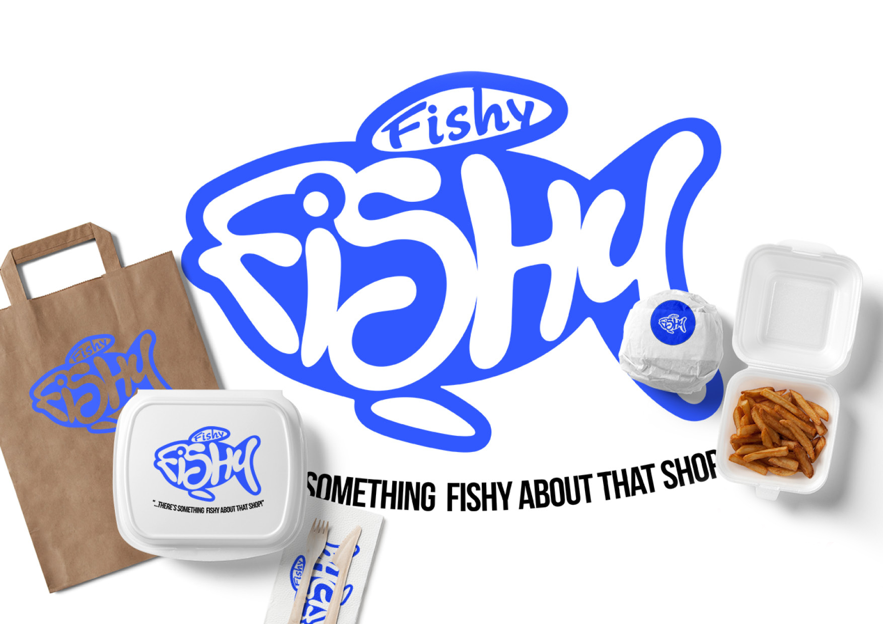
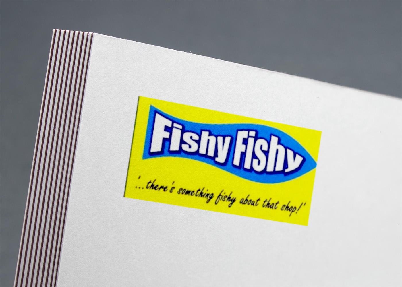
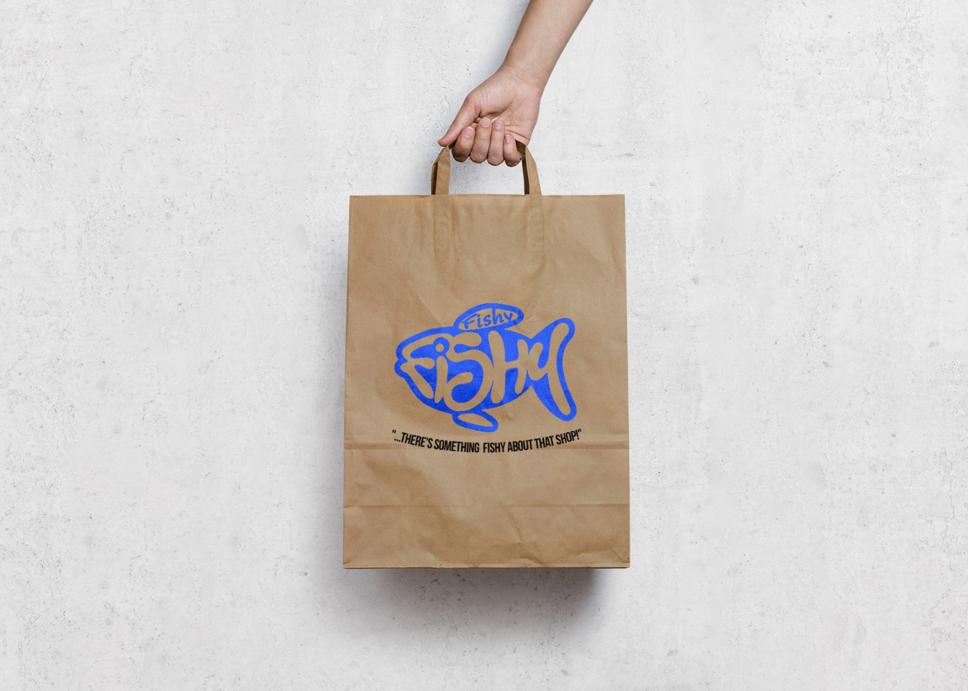
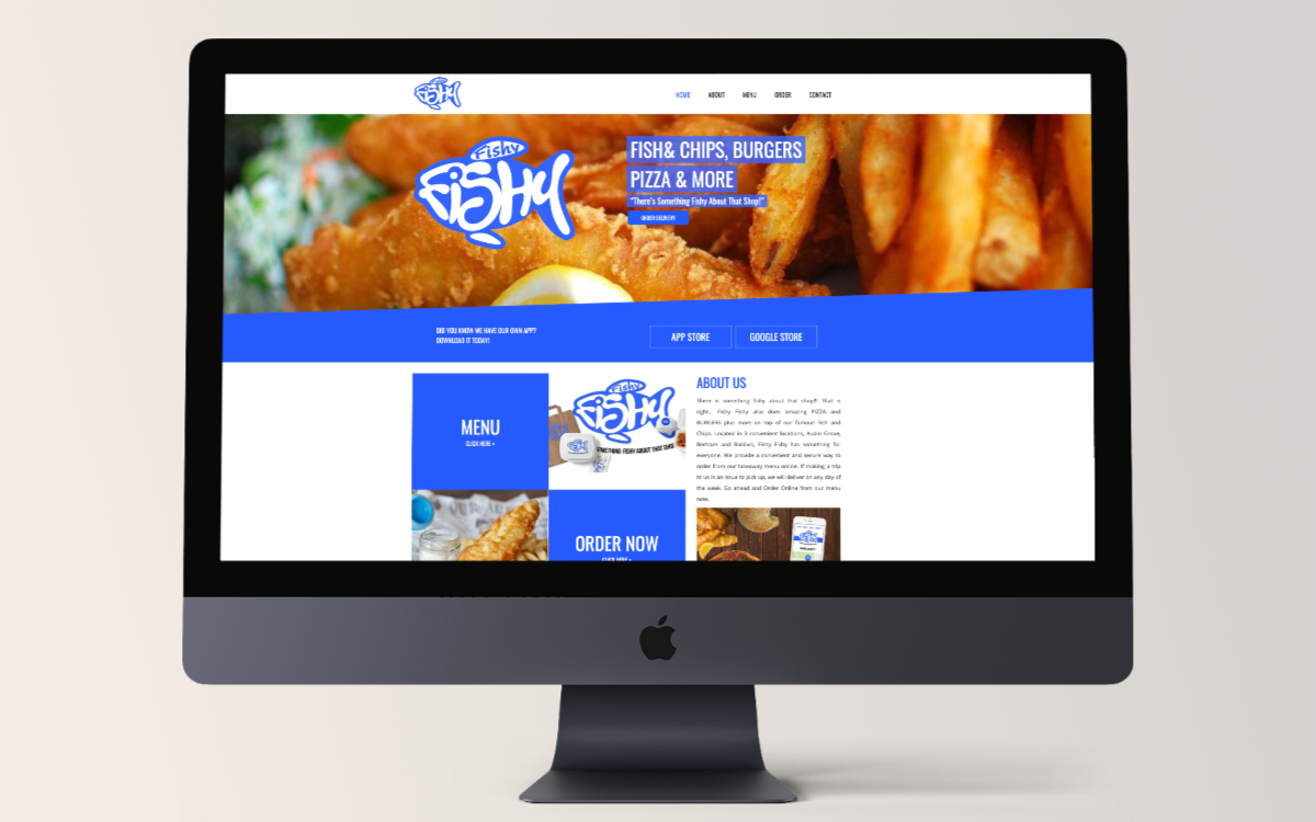
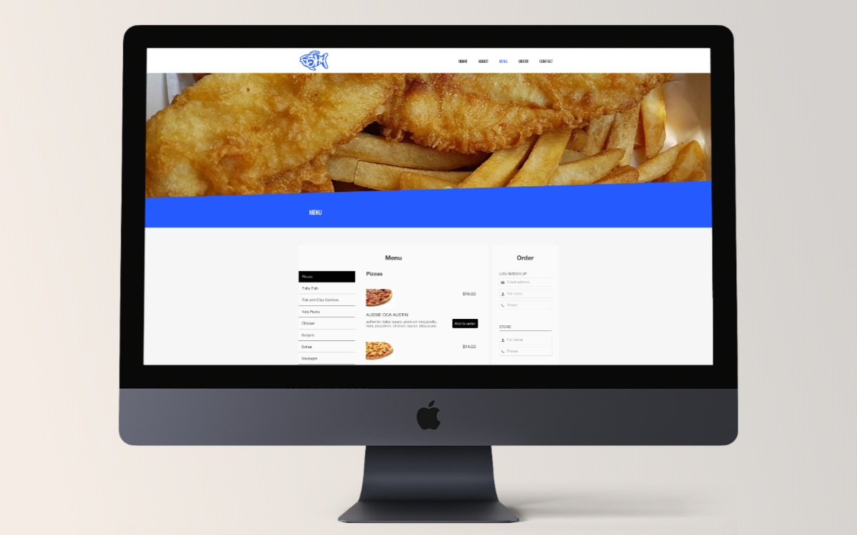
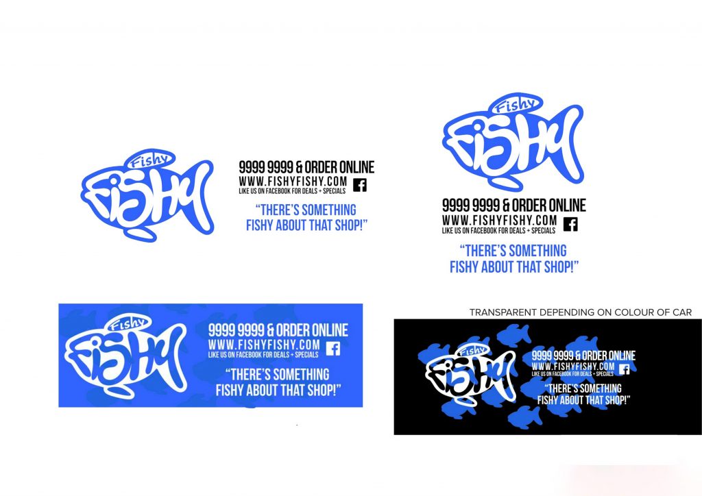
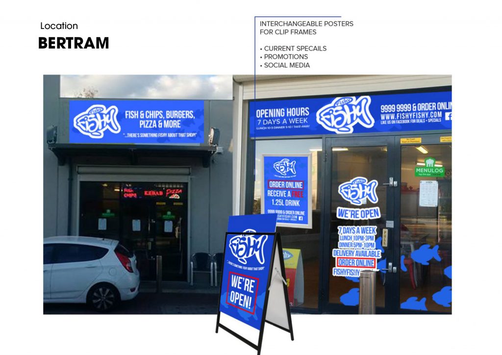
As you can see, fishy fishy came a long way. After the re-brand was completed we needed to find the best way to create fishy fishyonline ordering system. After some research we established our best option was to partner with a popular New Zealand company thatoffers online ordering, online ordering app and also printers for each store. We designed and developed the website andintegretated the online ordering system.
Red Mark Completed: Creative Brand Strategy | Brand Logo & Identity | Print Design | Website Creative | UX & UI Design | Website Development

#3264ff

#000000

Rinwa

IWIRC(WA) became RINWA in 2018, which stands for Restructuring & Insolvency Network Western Australia. RINWA will continue to encompass the fundamental IWIRC objective, to promote diversity in the insolvency industry.

Strategy
Brand development

Task.


IWIRC(WA) is part of an international brand but due to their network growth they decided to go independent. The task was to create a name that was only known within the industry but would represent a welcoming environment filled with opportunities for practitioners (in particular junior practitioners) to build their professional networks

Decision.


We started with an idea of a network representation and a colour scheme that was inviting. We simplified that thought and with the IWIRC(WA) team we decided on the name RINWA as it was a strong representation for the WA chapter. Another influence was that all the other Australian chapters followed a similar concept.  

#4a4a4a

#54baff

#ffffff

Raleway Bold

Raleway Light

Lusso Group Brand

Perth's largest selection of natural stone, engineered stone and porcelain panels. Lusso acquires some of the world’s best and most exotic stone and exclusive variety of designs to add a touch of elegance to any kitchen, bathroom or alfresco project.

Strategy
Brand development
Print design

Task.


Lusso Group outgrew their brand and desired a look and feel that would represent their values and compliment their growth that would not only be current now but also in the future. 

Decision


We needed a direction and after a good competitor analysis and creating brand recognition & brand positioning strategy we decided we would focus on strong symbol to play a part of the logo and be the key influencer of a noticeable brand identity. This will then be passed on to the sub-brands.  It turned our like this.

Now that your have seen the brand identity, watch out for the brand features that connect Lusso Group with their products Natural Series & Bella Series but yet, powerful enough for Natural Series and Bella Series to stand on their own. Then we arranged the content as a photography style was very much needed for Lusso Group to archive the look and the feel they desired.

#927a53

#20678a

#0d121b

ENGRAVERS

GOTHAM