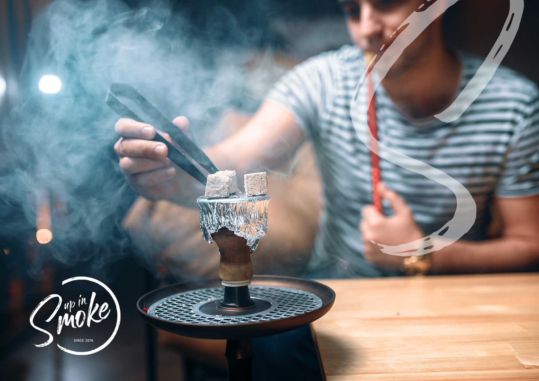
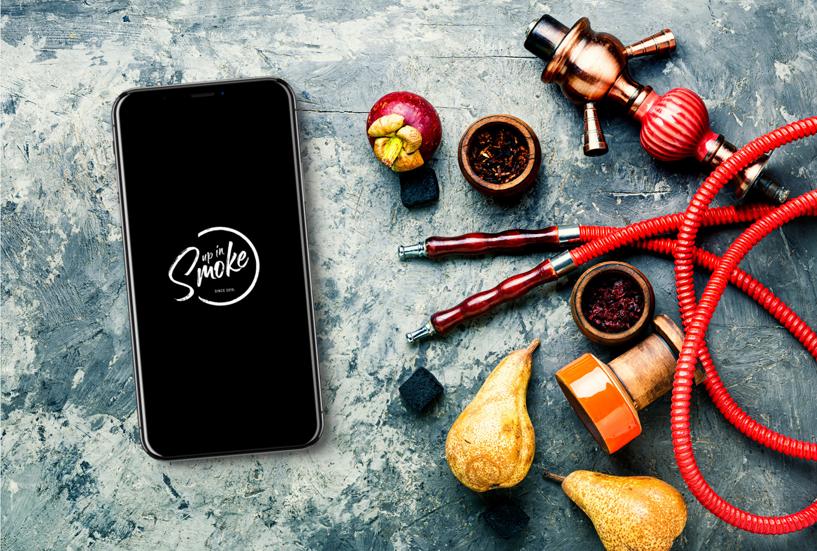
Perths biggest shisha retail store with the widest range of shishas and shisha accessories.
Strategy Brand development Print design
Task.
Up In Smoke was a new business that needed a simple brand but strong brand recognition since the goal is to become the leaders of the new industry of shisha that had sensitive laws.
Decision.
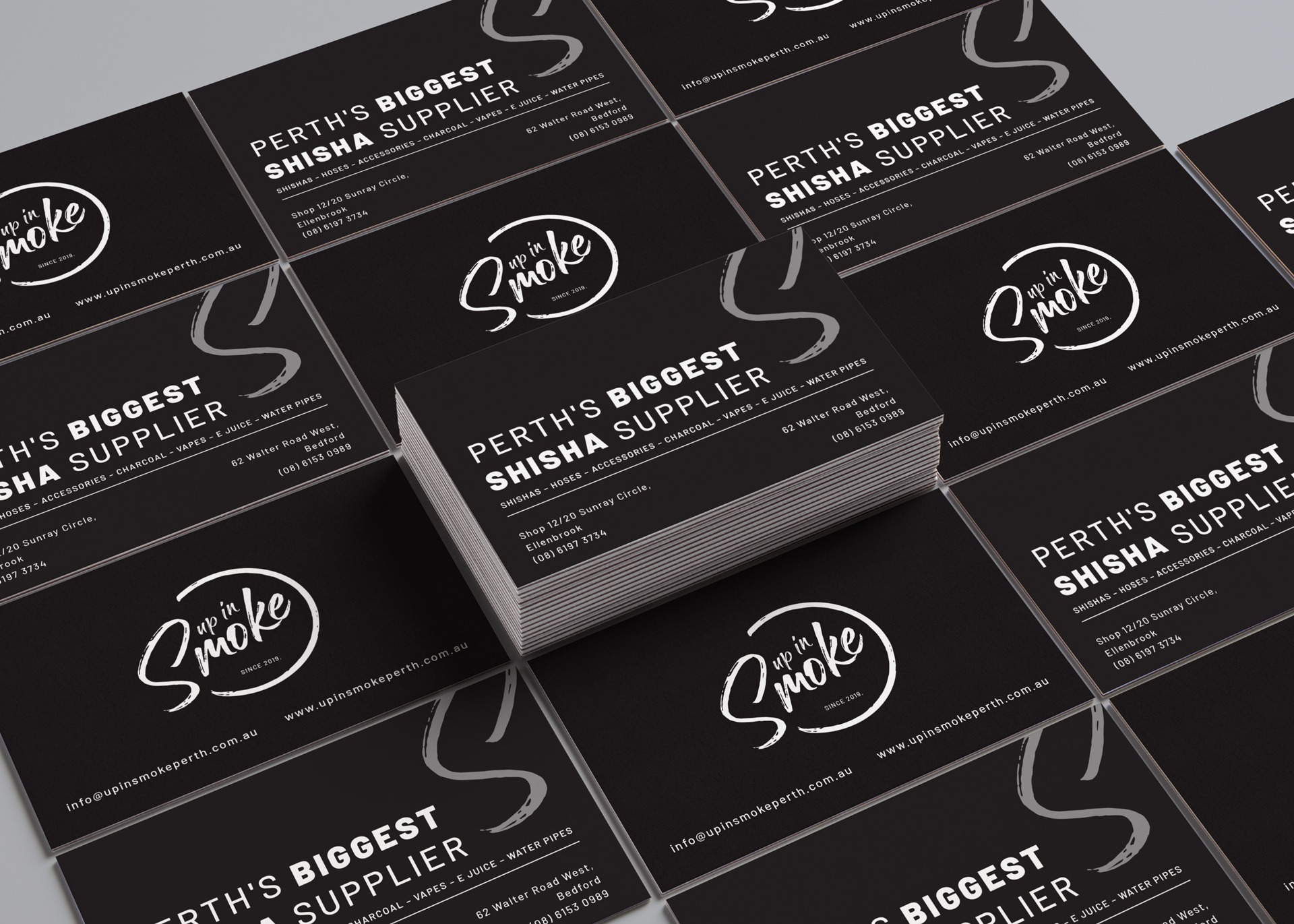
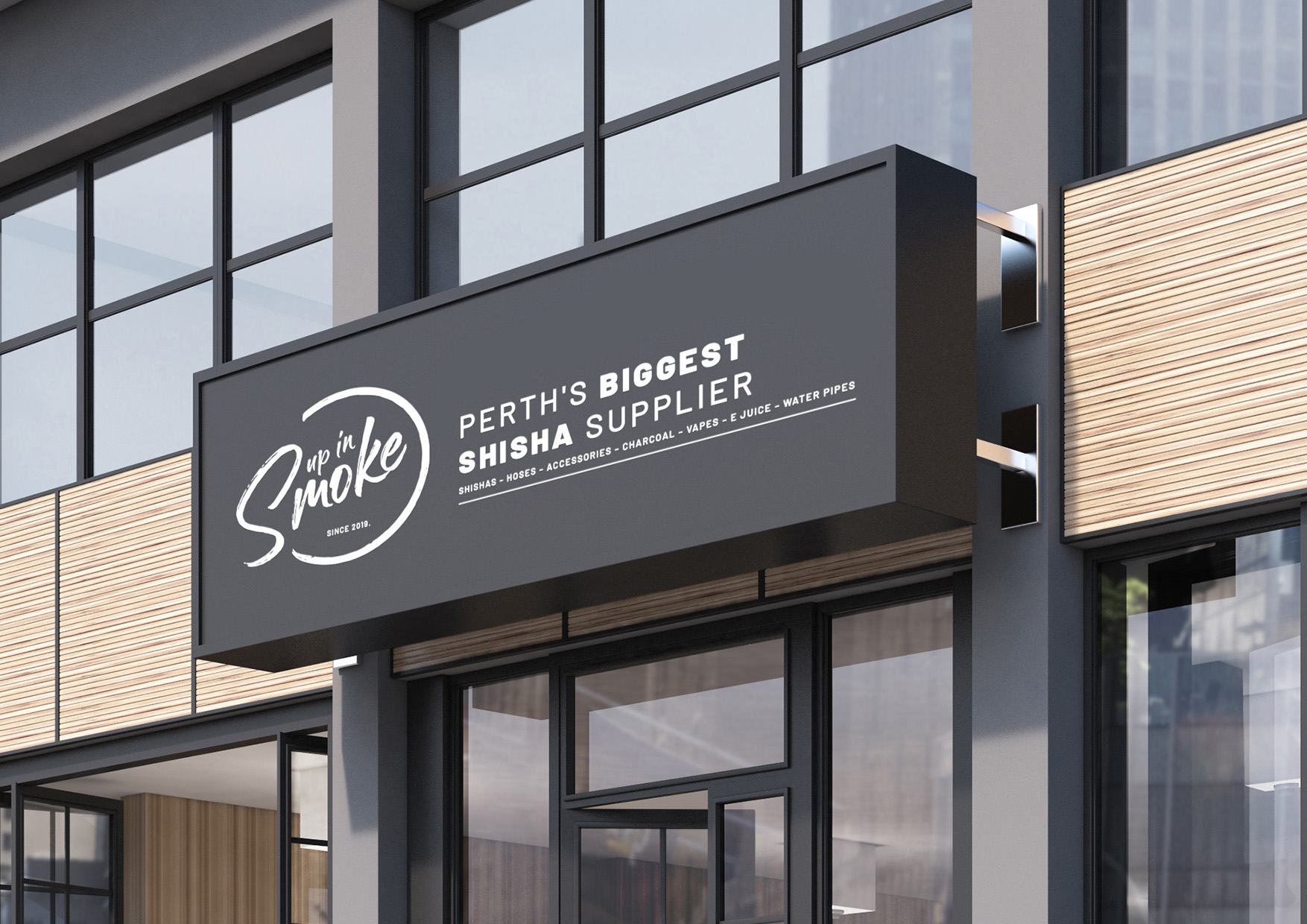
The decision was simple by going with colours black and white. Then we decided to create simplicity but strong brand recognition with a simple brand identity using the S in photo content where shisha is present as representation of smoke and a strong font for the tagline. Sometimes less is more and this project proves it.